 Canadian Dollars
 US Dollar

The Silent Staff: Mastering Signage to Guide, Inform, and Inspire
In your retail store, your signage is your silent staff. When a customer walks in, they are looking for answers: Where do I go? How much is this? Why should I care? If your signage strategy is weak, your customers feel lost. If it’s cluttered, they feel overwhelmed.
Here's some tips to master the art of retail signage to create an intuitive, professional, and straight forward shopping experience.
1. Navigation: Signage as a Roadmap
As stores move away from rigid gender-based sections toward lifestyle and collection-based layouts, signage has become the primary way to prevent customer confusion.
-
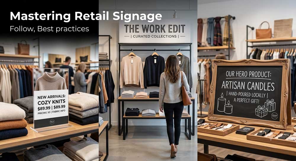
Define the Destination: Instead of generic "Men’s" or "Ladies'" signs, use high-level destination signage to define the vibe of the area, such as "Work Essentials," "Active Life," or "Seasonal Arrivals".
-
Wayfinding Beacons: In a non-segregated store, customers need clear beacons to lock onto from the entrance. Place small, clear navigation markers at the end of every row or at the top of your wall standards to guide their flow through the store.
-
Maintain Sightlines: Use your signage and display heights to create clear paths. Keep signage consistent throughout these lines of sight to ensure the store feels like one cohesive unit rather than a collection of random sections. Becareful not to block the main sightline.
2. The Information Hierarchy
Not all signs are equal. To avoid "decision fatigue," organize your signage into three distinct tiers:
-
Identification: High-level signs that tell customers where they are (Sections/Collections). These should be visible from across the floor.
-
Information: Signs located near the product that communicate price, fit, fabric, and key features. This is the "silent staff" answering questions so your team doesn't have to.
-
Promotional: Use these sparingly. Too many sales signs clutter the space and can devalue your brand by making it look like a discount store.
3. Balancing Personality: Computer vs. Handwritten
A great store uses a mix of signage types to feel both professional and human.
-
Computer-Generated (The Authority): Use these for permanent navigation, pricing, and sizing headers. This creates an atmosphere of professional consistency and clarity that helps customers shop quickly and easily. You can put your logo on your sign this way too.
-
Handwritten (The Personal Touch): Reserve this for "Hero" products or storytelling. A neat, handwritten note adds warmth and builds a personal connection with the customer.
-
The Chalkboard Strategy: Chalkboards are fantastic tools for "Retail Changeups." Because they are easy to update, they are perfect for temporary promotions or daily inspirations that help keep your store feeling alive and responsive.
4. Cohesion and Brand Integrity
Signage is a visual extension of your brand image.
-
Quality Matters: Mismatched, frayed, or poorly written signs can make a store feel stagnant. Ensure your sign holders reflect the professional quality of your fixtures. Don't let them yellow from sunlight.
-
Strategic Branding: Use your logo on your destination signs and price clips to create a professional, cohesive look that frames your products as premium.
-
The "5-Second Rule": A customer should be able to grasp the message of any sign in 5 seconds or less. If it takes longer, simplify the text and use more white space.
The Bottom Line: Your signage strategy should bridge the gap between "I’m looking" and "I’m buying." By balancing the professional authority of clear navigation with the human warmth of personal storytelling, you turn your store into an intuitive, welcoming destination.